Chapter 1. Perception of Color and Color Mixture Models
Last updated 30 January 2019
Roy G. Biv and the first dimension of color (Hue)

Roy G. Biv is a fictional person whose name is an acronym for the rainbow order of hues: Red, Orange, Yellow, Green, Blue, Indigo, Violet. Visible color is a small part of the electromagnetic spectrum that includes radio waves, microwaves, infrared, visible colors, ultraviolet light, x-rays, and cosmic rays. In the visible region red has the longest (and lowest energy) wavelengths while violet has the shortest and highest energy wavelengths. Red is on the outside of the rainbow (the longest side) and violet is on the inside of the arc (the shortest side). If you ever have the privilege to see a double rainbow, take a close look. Since the second rainbow is formed from the reflected light of the first, its colors are reversed! However, hue is not the end of the story.
The second dimension of color (Value)
In the artist's vocabulary, lightness and darkness are known as value. We shall call our measure of value lightness and it shall range from 0 (black) to 100 (white) with various shades of gray in between.

Figure 1. Shades of gray from 0% to 80% black in 20% increments.
Gray is necessarily a relative value. When we judge something as gray we mean gray in comparison to how a white object under the same lighting would appear. The above panels can be considered as either white swatches under dimming light or progressively grayer swatches under constant lighting. That gray is relative can be easily shown by a number of illusions, the most famous being the Adelson's checker shadow illusion. For the same reason, one cannot buy a gray light bulb because illuminated gray glass doesn't look any different than a less powerful but white bulb.
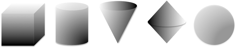
In Figures 1, 3, 4, or 5, you may also notice a kind of scalloping effect where the interface between swatches appears raised and the central portion of each swatch appears depressed, sort of like a scalloped Roman column. This is a byproduct of the visual system's contrast enhancement process. Each swatch is a constant value that does not lighten as it approaches the boundary of the darker swatch. However, your visual apparatus amplifies the contrast at the boundary because edge definition is a main priority of the visual system (both in human vision and computer vision). Similar gradients are produced by scalloped surfaces and in the absence of other contextual information the ambiguity is interpreted by the visual apparatus as signaling a topological effect.
Interaction of Hue and Value
Although value and hue are separate measures, they interact in ways you might anticipate. For example, we have an intuitive sense that yellow has a lighter value than blue, and indeed it does. Thus, hue and value are in some sense correlated even though they are different measures. Figure 2 shows the grays of equivalent value for your computer monitor's best approximation of unique yellow, unique green, unique red, and unique blue. In other words, if these colors are photographed in black and white or shown on a black and white video monitor, yellow shows lighter than blue. By unique hues, I mean the the purest representations of each hue as judged by the statistical average of those with normal color vision.

Figure 2. Equivalent grayscale of some colors.
There are also value-hue interactions that you may not expect. For example, below are various shades of blue in steps of equal-brightness. The hue is constant, but it appears to shift toward purple with reduction in brightness.

Figure 3. Blue shades in order of darkening value.
We also perceive many colors that are not in the rainbow: there is no olive green, brown, or gray in the rainbow and we are able to perceive various shades of purple termed extra-spectral purples. Why is this? We shall answer each question in turn, but a broad answer is that color is a psychological phenomenon created in the mind. Hues and wavelengths can be measured, but color is experienced.
Why is there no olive green in the rainbow? It turns out that olive green is actually dark yellow. Well... there's no such thing as dark yellow is there? That's because we call it olive green and don't think of it as yellow, but colorimetrically the hue is yellow and in the absence of context your perceptual network perceives it as a dull yellow-green. Look at Figure 4. Are these yellow swatches under various illuminations or different shades of yellow-greens under constant illumination? With no contextual information to suggest changing illumination, the darker values of yellow are perceived as shades of olive green.

Figure 4. Shades of yellow.
What about brown? Brown is dark orange. One cannot buy a brown light bulb because if you increase the value of brown by shining a light through it, it will look orange or, perhaps with enough illumination, yellow-orange, but it will not look brown. (A little white Christmas light in an empty root beer bottle proves my point.)

Figure 5. Shades of orange.
The third dimension of color (Chroma)
We may consider hue purity to be a third dimension. Chroma is one measure of purity or color intensity. We shall say that at full strength, the purest and most intense pigment has a chroma of 100. At the opposite extreme is a neutral gray having the same value as the pure pigment but a chroma of 0. Now suppose we add that neutral gray to the pure intense pigment so that the mixture is only half as intense. We shall say that mixture has a chroma of 50. Figure 6 shows unique yellow, green, red, and blue starting at full saturation (left, chroma = 100) and desaturating at constant value to a pure gray (right, chroma = 0).
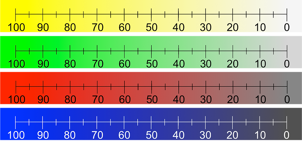
Figure 6. Unique colors at constant value and decreasing chroma.
(The hue is fully saturated before the 100 marker and fully desaturated after the 0 marker. It desaturates uniformly between the two extremes.)
Hue and chroma are also correlated. The highest chroma pigments in the red-orange region have higher chroma than the highest chroma blue-violets. This paper gives an idea of correlations among hue, value, and chroma. In summary, the three dimensions of color are: hue, value, and chroma. It is appropriate to think of these as separate dimensions of color, though interacting in real life.
The shape of color
Well, if color is three dimensional, what shape is it? Surprisingly, many shapes have been proposed and depend on how we define measures for hue, purity, and value. The RGB (red, green blue) space that your computer monitor operates in may be considered cubical with red, green, and blue dimensions. Therefore, all colors are represented as blends of red, green, and blue light. Below is your computer's color cube sliced and diced into 125 pieces (5 x 5 x 5). A computer's actual granularity is typically 256 x 256 x 256 = 16,777,216, which means a typical computer display can represent nearly 17 million colors. However, 125 colors will suffice to illustrate this discussion.
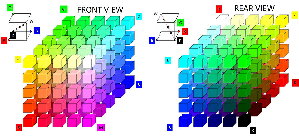
The point is that any color may be represented by some combination of R, G, and B. If your computer wants to make a fully saturated yellow, it fully turns on the red and green pixels: (R G B) = (255 255 0). To make white, it fully turns all three on (R G B) = (255 255 255). For black, it shuts all three pixel types off (RGB) = (0 0 0). The limits of your computer's color space are found at the cube's corners: R, Y (yellow), G, C (cyan), B, and M (magenta), W (white), and black (K). The axis from K to W (i.e., the left-bottom corner to right-top corner) is known as the neutral axis. It represents all the colorless values, black through gray to white. The math is very simple. For example, in RGB space R = (255 0 0), G = (0 255 0), and B = (0 0 255). Then R + G = (255 0 0) + (0 255 0) = Y (255 255 0). Anything having three equal RGB coordinates resides on the neutral axis and is either black, white, or gray. For example, a medium gray is (R G B) = (128 128 128).
One may also represent hue as an angle from 0 to 360 degrees. If one views the cube looking along the neutral axis and starts with R = 0º then Y = 60º, G = 120º, C = 180º, B = 240º, M = 300º, and back to R = 360º = 0º. Measures of color purity are given as radial distances from the neutral axis, and measures of value are given as distances along the neutral axis. This essentially defines a cylindrical system. However, differences in definitions for purity and value lead to different color spaces. For example, there are several cylindrical systems including HSL (hue, saturation, luminance) or HSB (hue, saturation, brightness) and HSV (hue, saturation, value). The Ostwald model and NCS color systems are biconical as is HCL space (hue, chroma, luminance). HCV space (hue, chroma, value) is conical. Runge proposed that color was best thought of as spherical. So which is it?
Well, based on psychometric measurements, a distorted sphere is probably most accurate. (Of course, if the sphere is distorted, one could just as easily say that it is a distorted bicone, or what have you.) Distortions arise due to the visual perceptive network itself. For blending with light, cubical RGB space is the most convenient. For blending pigments (as is done in watercolor and other painting) the unanimous representation is to use a color wheel with a vertical dimension for value. However, all of the non-cubical solids shown above do this because a cross-section through any of them is a circle. I prefer CIECAM space, and it is cylindrical (see below). Notwithstanding, distortions arise due to the visual perceptive network itself despite CIECAM's best attempt to linearize them.
Some Definitions
The problem with developing measures of color, purity, and value is that we are attempting to quantify perceptions of the human mind. For example, luminance is a physical quantity that can be measured directly, but its perception by the human mind, i.e., brightness, is a psychometric quantity. The standardization of these mental quantities is a large part of the science and purpose of colorimetry and this requires careful definition of terms. I've bolded the headings for measures that are of interest in watercolor.
Brightness. We define brightness as the perceived quantity of light from a source. At its extreme, the human eye can function in lighting as dim as a dark theater to as bright as noonday sun; this represents a ratio of about 14 orders of magnitude, 1: 100,000,000,000,000. Yes, that is an unfathomably large number. In order to process light information over this range, the visual system uses a logarithmic (not linear) compression. This explains why photographers must use a light meter to keep from badly overexposing their film. What appears to be a small difference in lighting for the eye can overwhelm an unadjusted camera.
Lightness. We define lightness as the brightness of a source compared to white under the same conditions and normalized from 0 to 100. Thus lightness is a relative rather than absolute measure of reflected light.
Colorfulness. We define colorfulness as the perceived degree of difference from a neutral gray. Since it is always easier to distinguish a color from a gray in brighter light, colorfulness increases with brightness.
Chroma. To get a relative measure of colorfulness (i.e., independent of illumination level), we define chroma as colorfulness/brightness-of-white normalized from 0 to 100.
Saturation. We define saturation as colorfulness/brightness and normalized between 0 and 100. Thus Chroma and Saturation are both relative measures of colorfulness. However, saturation is normalized by its own brightness while Chroma is normalized by the brightness of white under the same illumination. Briggs has a very helpful discussion of the differences among colorfulness, chroma, and saturation here.
Hue. We define hue as the perceived similarity or difference to unique red, yellow, green, or blue.
For relative comparisons in watercolor, all we need are hue, chroma, and lightness.
Human Color Perception: The Munsell System and CIECAM

Human color perception may be modeled as a finite cylinder where hue is mapped as an angle from 0 to 360 degrees around the cylinder; chroma (0 to 100) is mapped as the radial distance from the cylinder's central axis; and lightness is mapped from bottom to top (0 to 100) in the vertical dimension: at the bottom is pure black and at the top is pure white. (I've terminated the cylinder at left at about the 50% lightness value but it continues up to pure white.)
One of the best known color systems is the Munsell system, created by the American artist Albert H. Munsell and based on rigorous human observations. (Yes, one can be an artist and a scientist per many examples.) CIECAM is a mathematical color appearance model (CAM) based largely on the Munsell system. It was developed by the Commission Internationale de l'Éclairage (CIE), or in English, the International Commission on Color. CIECAM02 is the latest CAM and in my humble opinion, it is the best representation for watercolor.
Bruce MacEvoy's watercolor site is an excellent one and he has a very good map of pigments in CIECAM space here. His map is a top-down view (2D) of each pigment at a single dilution corresponding to its maximum chroma. Therefore, it does not show how hue, chroma, and lightness shift with dilution on paper: as watercolor pigment is diluted, its hue must shift toward that of the underlying paper (though in a surprisingly circuitous fashion, even in CIECAM coordinates) all the while climbing on the value scale and receding inward on the chroma scale until at infinite dilution it assumes the hue, chroma, and lightness of the paper. To get an idea of how some common pigments fill CIECAM space, I prepared a number of dilutions, measured them with a NIX color sensor, and calculated their place in CIECAM space. The next figures show them in top-down (2D) and 3/4 (3D) views. The blues and violets approach from the darkest values while the yellows start out much lighter. You may download a pdf of the 2D chart here.

Figure 1. Pigments in CIECAM space, 2D (left) and 3D (right) representations.
Below is a movie that shows the 3D surface in CIECAM space for 30 or so selected pigments. The direction of dilution is from bottom to top where all pigments converge to the hue, chroma, and lightness of the paper, hereafter called the paper point.
Figure 2. Video of rotating color surface.
What are primary colors in the subtractive color system?
Additive color systems model combinations of colored light sources such as those found on your computer screen or television; i.e., R, G, and B. However, subtractive color systems model reflected light from pigments such as watercolor pigments. We have all heard by now that there are three primary colors in the subtractive color system (R, Y, and B) and that one can obtain all other colors by mixing them. In fact that is not perfectly true in any sense. No three pigments will adequately simulate all colors because color space has convex contours so there are always places where a linear combination of several pigments cannot reach. Many printing systems use four colors: cyan (C), magenta (M), yellow (Y), and black (K) because they capture more of the perceivable color range than R, Y, and B. For better color fidelity, some printing systems use 6 colors, and high quality giclee prints employ 12. And despite what you may have heard about primary colors, they really aren't primary. For example, M + Y = R; C + Y = G; and M + C = B. Your color printer does this every day.
The Color "Wheel"
Most watercolor books teach that R, Y, and B are primary colors and that by mixing them, one can arrive at any other color. The history of color is full of beautiful theories that are wrong or overly simplistic (e.g. Ostwald's color bicone and Runge's color sphere), and the color wheel is another example. This is not surprising, as color perception is a psychological phenomenon and highly non-linear. Notwithstanding, as G.E.P. Box was once quoted to say "All models are wrong, some are useful," and such is the case here. As the theory goes...
R, Y, and B are "primary" colors (indicated in the figure at right by heavy solid circles at 4, 8, and 12 o'clock, respectively).
Mixing these "primary" colors gives three secondary colors, orange (O), green (G), and violet (V) (or more properly purple since it is surely extra-spectral, but the redder side of purple I call violet, and I pray the reader will indulge me.) I have indicated the secondary colors with a double ring.
Mixing a primary and a secondary color results in six tertiary colors: blue-green a.k.a. turquoise or cyan (C), purple or blue-violet (BV), red-violet or magenta (M), red-orange (RO), orange-yellow (OY) and yellow-green (YG). Tertiary colors are indicated with a triple ring.
Mixing any color with its opponent on the color wheel – for example Y+V, R+G, or B+O, among others – supposedly gives a neutral gray (NG or A).
This all sounds very nice, but try it. Real pigment mixtures give surprisingly different results. The fact is, R, G, and B are not truly primary; for example, your color printer uses C, M, and Y for its "primary" colors and mixes them to get R, G, and B. When it wants gray it does not mix C, M, and Y but uses black (K) and places it more or less lightly on the paper to adjust the shade. So according to your printer C, M, Y, and K are primary colors. But even these are not enough for good color matching. Pantone® has an extended Gamut that uses seven colors (C M Y K O G V) and blends 14 pigments to achieve 1,114 spot colors. Suffice it to say that if the color wheel were accurate, you would only need three paints, and the reality is that you are going to have to buy a dozen or more for a good start.
At best, the color wheel is a rough guide to mixing pigments. Moreover, anytime pigments are mixed their value decreases because more light is absorbed and less is reflected. By the time you get to tertiary colors, you may have little more than colored mud if you're not careful.

Perhaps it would be better to think color mixtures as linear blends of their components. Then the color "wheel" becomes a color triangle with each daughter mixture resulting in poorer chroma than its parents. In the figure at right the three concentric circles represent, from outer to inner, full chroma, 2/3 chroma, and 1/3 chroma. Neutral gray (A) has no chroma and occupies the center. A mixture of yellow and gray generally results in a gray that is perceived to have a greenish cash (GA), while mixtures of blue and red with gray result in grays with a bluish (BA) or reddish (RA) cast, respectively. No matter what the primary colors, subsequent mixtures always become muddier (i.e., lose value and chroma).
Unfortunately, the blending is not linear, so the best way to account for real mixtures is to actually blend them, measure the with a color sensor, and interpolate in the color space using an empirical blending equation such as a Scheffé cubic polynomial. I've done this for a few ternary mixtures immediately following. The diagrams each comprise 66 mixtures of the three paints noted. The pure components are in each corner, the binary blends are those along the edges, and the ternary blends comprise the interior swatches.
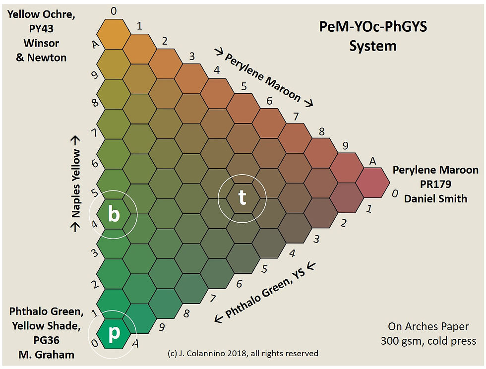
As an example, in the sample at right, the circled swatches p, b, and t represent the respective primary, binary, and ternary blends: pure phthalo green, 40:60 yellow ochre: phthalo green, and 50:20:30 perylene maroon: yellow ochre: phthalo green (In the charts, "A" means "10" out of 10 parts or 100%).

The graphic at left calls out the name of each cell.
The colors below are your computer's best representation of my measurements. The background in the pictures that follow is your computer's best approximation of the paper I used. So, if you mix your pure colors to match the hues shown in the corners, and you place the blends on watercolor paper similar to mine, then the colors shown should be a good indication of what you can expect in the blends. To reiterate, all of the charts below are measurements from actual mixtures of pigments. They are not mere theoretical models.
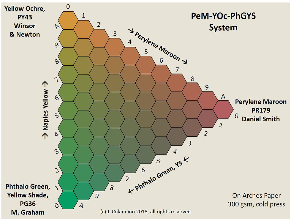
Figure 3. Ternary Mixture Diagram: Perylene Maroon/Yellow Ochre/Phthalo Green (Yellow Shade). Phthalo Green is especially dominant in this system.
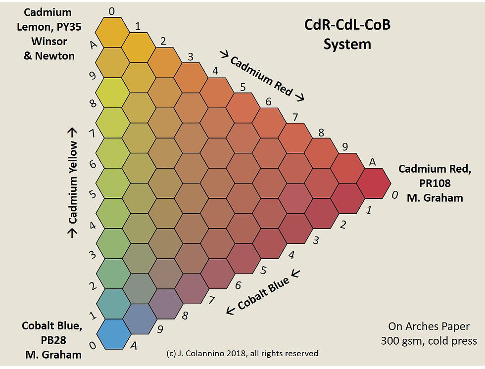
Figure 4. Ternary Mixture Diagram: Cadmium Red/Cadmium Lemon/Cobalt Blue. Note the relatively weak tint strength of Cobalt Blue.
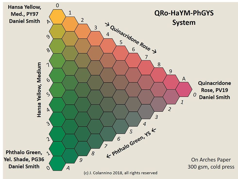
Figure 5. Ternary Mixture Diagram: Quinacridone Rose/Hansa Yellow Medium/Phthalo Green (Yellow Shade). Note the overwhelming tint strength of the phthalocyanine green. Mixtures with phthalocyanines require care so as not to overwhelm.
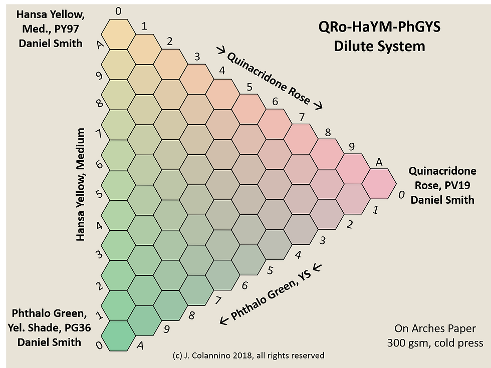
Figure 6. Ternary Mixture Diagram: Quinacridone Rose/Hansa Yellow Medium/Phthalo Green (Yellow Shade). Note that quinacridones and phthalocyanines both have strong tint strength with Phthalo Green being stronger than Quinacridone Rose.
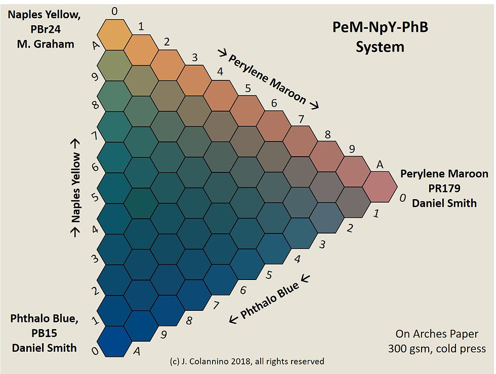
Figure 7. Ternary Mixture Diagram: Perylene Maroon/Naples Yellow /Phthalo Blue. Note how the powerful tint strength of Phthalo Blue dominates the above chart. Therefore, one should be judicious when using Phthalo Blue as part of a blend – a little goes a long way.
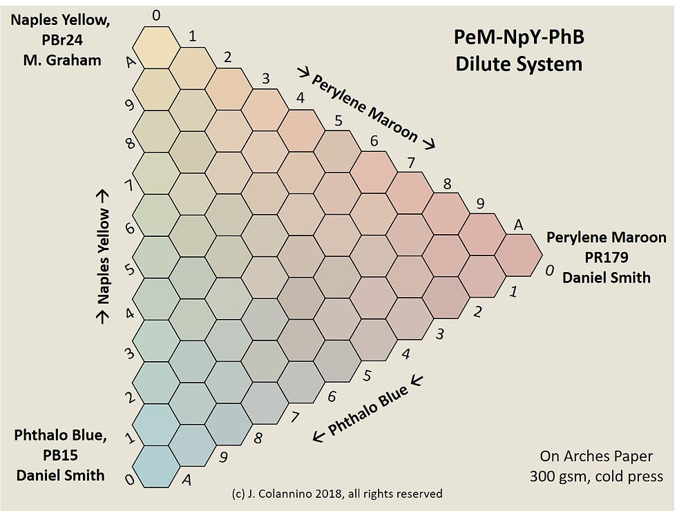
Figure 8. Ternary Mixture Diagram: Perylene Maroon/Naples Yellow /Phthalo Blue. More appropriate dilution of the phthalo blue gives better balance to mixtures. I find this system to be particularly good for skin tones.
If the color spectrum is linear why is the color wheel round?
The spectrum is indeed linear. The problem is that color vision is a mental construction of the spectrum based on the inputs from (only) three photoreceptors in the eye (called cones) that sense visible light for long (L), medium (M), and short (S) wavelengths. The S cones have a maximum sensitivity at a wavelength of about 440 nm which is in the blue range of visible light, the M cone has maximal response at about 540 nm in the green region. The L cone has a maximal sensitivity at about 570 nm (Figure 3).
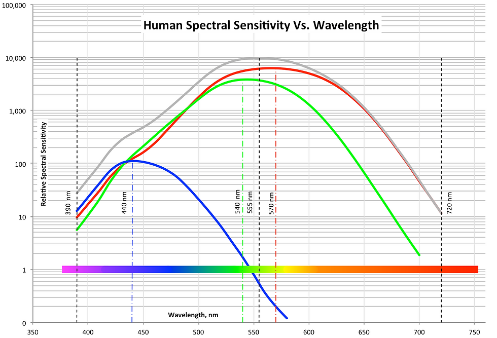
Figure 3. Spectral sensitivity vs. wavelength.
The sum of the cones has a maximal response at about 555 nm, the yellow-green part of the spectrum, and it follows that human color vision is most sensitive there. The cones are sometimes called red, green, and blue cones, but this is a misnomer as the cones have wide overlap; so L, M, and S cones are the preferred terminology.
With respect to computer displays, computer monitors and smartphones: these have their own light sources and need not rely on reflected ambient light. These devices mix colors using additive color rules and simulate millions of colors using just three light sources: red, green, and blue (hence the name RGB display.)
Color Subtraction Vs. Color Addition
When painting, we are not working with color addition, but color subtraction and the rules of the game differ. Mixing red and green pigments gives a muddy gray that is perhaps brownish or greenish, depending on the exact pigments used, while adding red and green light gives yellow. Since both the L and M cones are stimulated, blending red and green light is indistinguishable from pure yellow light which also stimulates the same cones to the same degree. (You may prove this to yourself by directing red and green laser pointers to the same spot on a white wall.)
Different color combinations that stimulate identical color responses are known as metamers and without them watercolor would be impossible. Suppose we have a pigment that reflects green and blue wavelengths but absorbs all others. That pigment would appear to be a bluish green (a.k.a. cyan, C). Likewise, a pure magenta pigment (M) would reflect red and blue but absorb all others. So mixing magenta and cyan pigments will give blue, the only hue that C and M both reflect. The math is something like this: C= –R+B+G; M=R+B-G; (C+M)/2= 0+B+0 = blue. So the red is subtracted out by the cyan and the green is subtracted out by the magenta, leaving only blue to reflect. Because we are subtracting reflected colors, mixing pigments together always results in a darker value because more light is being absorbed.
Unlike the RGB additive model, subtractive models are notoriously complicated because real paints do not reflect a single wavelength but an entire spectrum, and for watercolors, the layers are not optically thick meaning that the interaction of the color and the paper is important. The simplest subtractive model uses the geometric mean of the reflectances of the primary pigments. For example, suppose we have the following "primary" colors which reflect light in the following RGB equivalents: C*= (16 255 255), M* = (255 16 255), and Y* = (255 255 16). Then the geometric mean of this C* and Y* is (RGB) = [√(16x255), √(255x255), √(255x16)] = (64 255 64) This results in a reasonably good model, but it is important to note at least one major deficiency: if we actually had a cyan pigment equal to the theoretical C = (0 255 255) then it would absorb red light completely and any mixture with this cyan, no matter how slight, would completely obliterate all red reflections. This is obviously absurd. We may take some comfort knowing that real pigments have much more complicated reflectances with no perfect absorption of any visible wavelength.

So to a first approximation, the geometric mean of the reflectance curves of the mixture components results in something close to the actual reflectance. For example, the theoretical C* Y* M* pigments just discussed result in the hue triangle shown at right according to the geometric mixing rule. The mixture hues seem about right. The circles represent constant chroma contours with the highest chroma at the periphery. Note that each daughter mixture results in poorer chroma than the highest chroma parent.
Why is there no bluish yellow or reddish green?
No one can imagine a blue-yellow or red-green? Why not? One can imagine a green-yellow, a yellow-orange, an orange-red, a red-violet, a blue-violet, or a blue-green. So why can't one imagine a blue-yellow or red-green? Apparently, trichromatic vision is hardwired to view blue/yellow and red/green as opponent pairs. This theory is known as the opponent theory of color. The L, M, and S cones measure light entering the eye and output to three channels: The R/G channel, the Y/B channel, and the W/B channel. The schematic below depicts the logic.
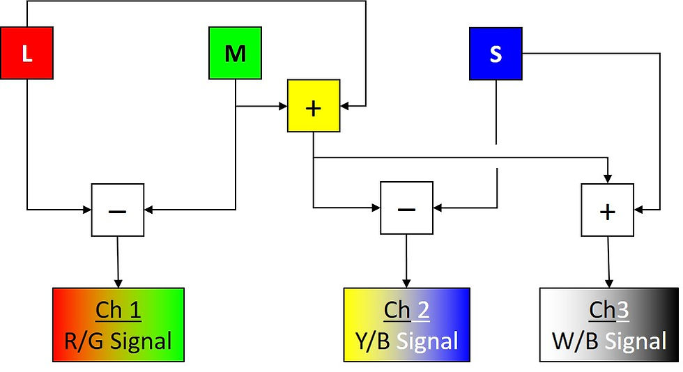
If L>M (i.e., L-M>0) then Channel 1 codes for some variety of red, if L<M (i.e., L-M<0), the channel codes for some variety of green. So it is not possible to perceive the difference between red with a little green or a dark red, both will give an identical signal on the first channel. Likewise, L+M codes for yellow so if L+M>S (i.e., L + M - S >0) then Channel 2 codes for some variety of warmer or cooler yellow, but if L+M<S (i.e., L+M-S<0) then the channel codes for some variety of warmer or cooler blue. One cannot have a bluish yellow or a yellowish blue because they collapse onto the same channel. Finally, Channel 3 codes for white on the strength of L+M+S and is involved in perceptions of value and relative colors such as gray, olive green, and brown. Purples that do not exist in the rainbow (extra-spectral purples) will also be perceived by the weighted combination of these channels. Indeed, under the opponent theory of color as few as two primaries can provide color matching (see Edwin Land's Retinex theory of color). However, the color matching is not as robust as a system using three or more primaries.
Moreover, the opponent theory of color suggests that there are four and only four unique hues: red, yellow, green, and blue. That is, if we ask human trichromats (those with typical color vision) to manipulate a color apparatus to produce a yellow with no hint of green or orange, they will agree within statistical limits on the same yellow, which CIECAM has standardized as having a hue angle of 90.00° (i.e., Due North or 12 o'clock, see next figure). This puts red at about 20° (ExNE or ~2:20), however, this convention is arbitrary. Computer color systems usually set red at a hue angle of 0° and scale the hues differently or even in the reverse order. Nonetheless, once the position of unique yellow is decided, other unique hues are fixed according to the scaling rules of the particular system.

In my opinion the CIECAM model is the best tool for color blending (perhaps the most accurate one we have). It is discussed in greater detail below and, as it relates to real pigments, in the next chapter.) The CIECAM convention gives a color wheel with unique red at 20.14° (~ExNE, ~2:20), unique green at 164.25° (~WxNW, ~9:30), and unique blue at 237.53° (~SxSW, ~7:00). The figure at right shows these unique hues at the periphery (full chroma) and also shows some watercolor pigments and their dilutions for reference. The black cross indicates the hue and chroma of the paper which is slightly yellower than pure white (white cross). The distance between unique hues (red to yellow to green to blue) is roughly the same (~72° or 1/5 of the circle between each pair). However, the distance between blue and red is about twice as far or about 144°. In between blue and red is purple, but there is no unique purple. We can adopt a purple by convention that is in the middle of the range as the Munsell Color System does, but no one can say that it is unique because all purples may be classified as reddish or blueish to some degree. Figure 3 shows selected pigment dilutions from multiple angles in CIECAM space.
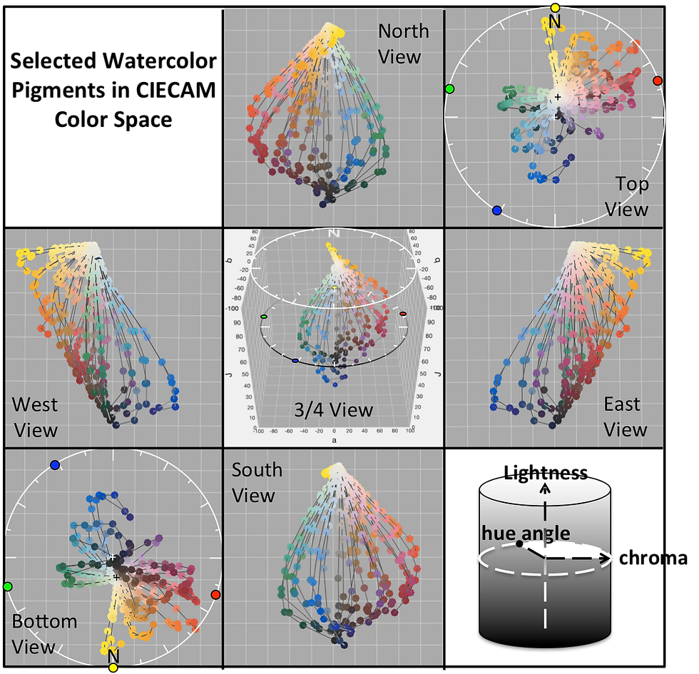
Figure 3. Watercolor pigments and unique hues in CIECAM Space as viewed from various perspectives.

The approximate pigments for these unique hues are Quinacridone Coral (PR 209), Hansa Yellow Medium (PY 97), Phthalo Green, Blue Shade (PG 7), and Cobalt Blue (PB 28). In addition to the name, I am giving the pigment designation (PY 97, etc.) because the name may vary from manufacturer to manufacturer, but the pigment designation uniquely identifies the actual pigment in use. However, these are not the only hues that could be used or that must be used. For fun, I painted Wine and Watercolor entirely from three pigments: Yellow Ochre (PY 43), Ultramarine Blue (PB 29), Perylene Maroon (PR 179), and none of which correspond to the unique colors given above.
One final note regarding computer displays versus four-color printers: the printed page has more spatial resolution but less color accuracy than either a color camera or an rgb display. So never rely on the colors that come from your color printer when painting a watercolor. The likelihood is slim that a computer printout will be faithful to human-perceived color. Smart phones and cameras are much better, but far from perfect and there are noticeable hue discrepancies between directly viewed hues and colors captured by digital cameras, especially in the red-orange region. So, always make field notes to accompany your photos that tell you what pigments you will use when painting. Over time you will learn to estimate perceived color as combinations of pigment hues.


